Getting Started with Xmrit’s Charting Tool
What does the Xmrit tool do?
Xmrit is the simplest way to create beautiful XmR charts directly in your web browser. Xmrit generates two charts from your data: an X-Chart (so-named after the metric you’re interested in, aka ‘the X variable’) and an MR-Chart (which stands for ‘Moving Range’).
You may read a more gentle introduction to XmR charts here.
All the data you input into Xmrit is 100% confidential, no data is ever sent to our servers. If you decide to share your XmR Charts with others the data is stored within the link, not at Xmrit.
What are the coloured dots?
XmR charts help you separate signal from noise in your data. It does this via a handful of detection rules. Historically, there have been many detection rules. Xmrit uses a simplified set of three rules, as introduced by Donald Wheeler in his books Understanding Variation and Making Sense of Data.
Rule 1: Process Limit Rule
When a point is outside the limit lines on either the X chart or the MR chart, this is a strong source of exceptional variation, and you should investigate.
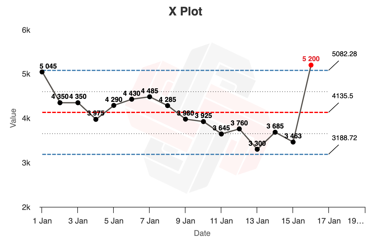

Rule 2: Quartile Limit Rule
When three out of four consecutive points are nearer to a limit than to the centre line, this is a moderate source of special variation and you should investigate. In the chart below, the dotted line is the mid-point between the centre line (in red) and the limit lines (in blue). Three out of four of the yellow points are below that dotted line, and are therefore nearer to the lower limit line than the centre line.

Rule 3: Runs of Eight
When eight points lie on one side of the central line (in red), this is a weak source of special variation and you should investigate

How do I create my first graph?
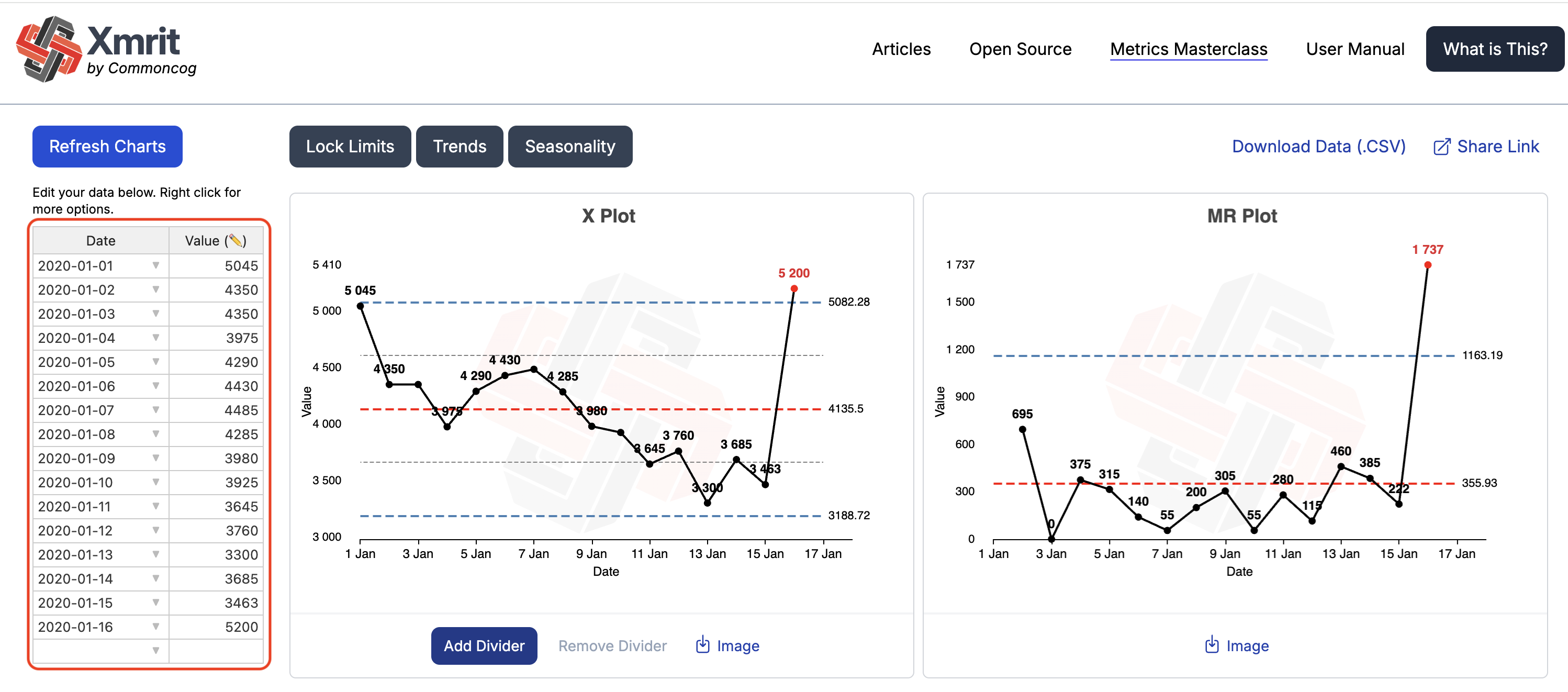
To create your first graph you need to enter your own data into the Xmrit spreadsheet, found on the left hand side of the tool and highlighted in red in the image below. The spreadsheet works like Excel and Google Sheets, and you can directly copy data from those programs into Xmrit, or directly edit the spreadsheet in Xmrit.
It is usually easier to paste in your data from a spreadsheet program, and make small edits in the Xmrit spreadsheet.
What data can I put into Xmrit’s spreadsheet?
In Xmrit’s date column the dates should be entered in the format YYYY-MM-DD e.g. 1991-01-25, however it will attempt to interpret incorrectly formatted dates.
The value column will accept integer and decimal values only.
How can I label my charts?
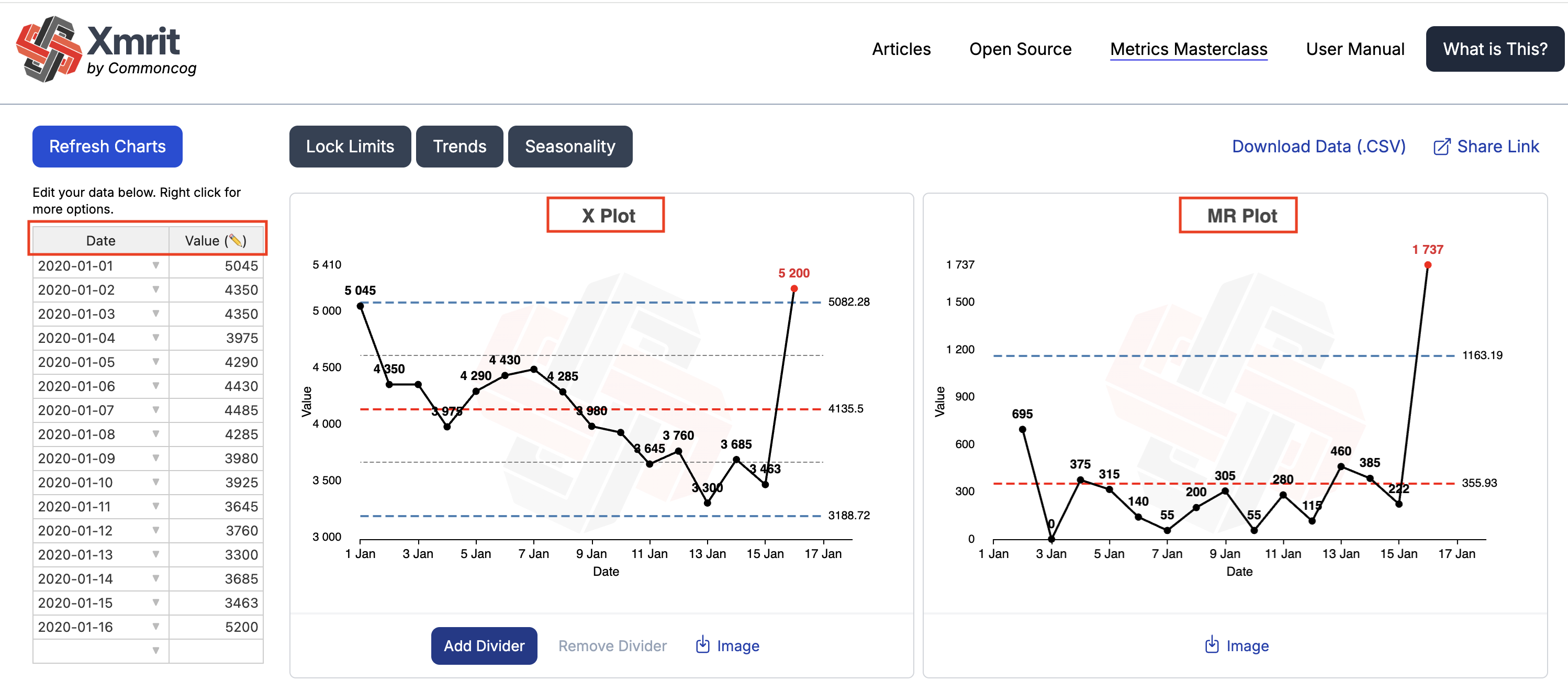
You can label your graphs by either clicking on the X-Chart axes in your XmR Charts or on the table headers in Xmrit. These are highlighted in red in the image below.
How do I download images of my XmR charts?
You can download the images of your XmR charts by clicking the download image button at the bottom of the X-Chart and MR-Chart.

How do I share a link to my XmR charts with others?
To share a link to your XmR Charts click on the share link at the top right hand side of Xmrit. The link will be copied to your clipboard, and can be shared with anyone you wish. All dividers and locked limits will be copied across in the link.

Advanced Functions of Xmrit
What are dividers and how do I use them on my data?
Dividers allow you to segment your XmR charts, creating multiple analyses within a single XmR chart. This is useful when you are trying to see if a change you made actually made a difference to your process. For example if you are analysing the number of calls a week your sales team is making you may want to divide your data on the date you introduced a new training plan.
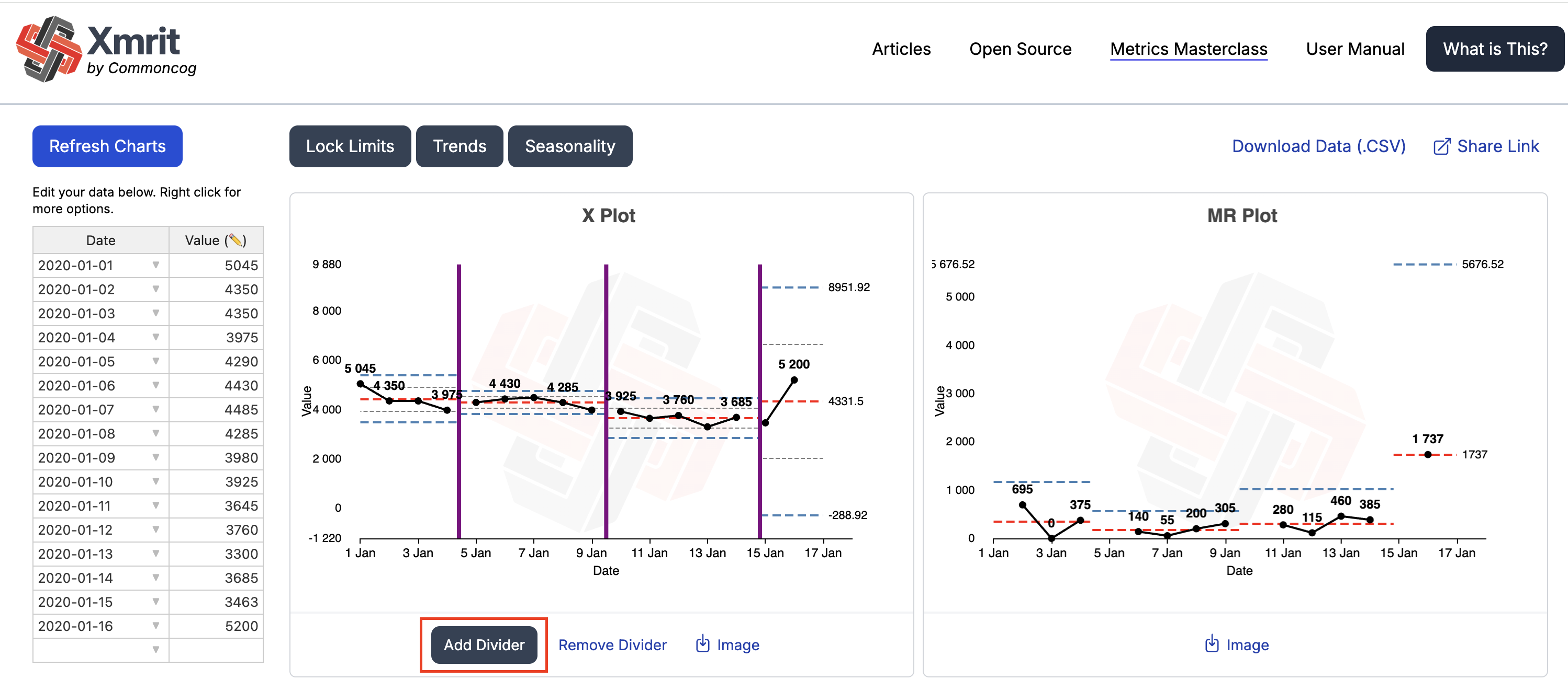
To add a divider click on the Add Divider button highlighted in red in the image below. When a divider is added to the X-Chart it creates a new segment, and the process limit lines are recalculated using only the points present within that segment.
You can add a maximum of 3 dividers onto one chart, creating 4 segments.
To remove a divider click Remove Divider.
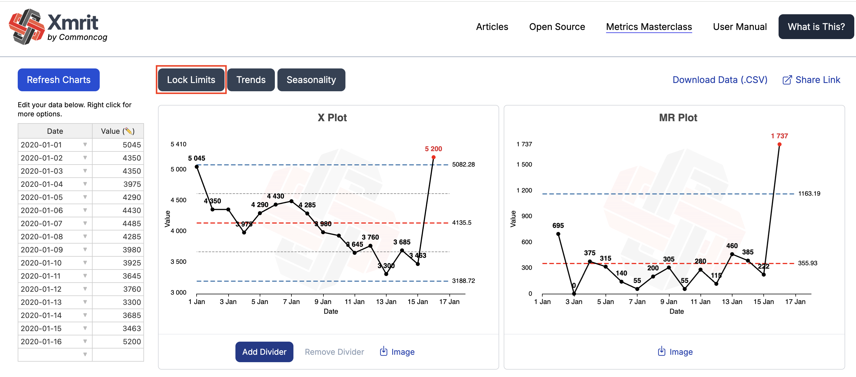
What is the “locking limits” button for, and how do I use it?
The control limits on a standard Xmrit XmR chart have their limit lines calculated from the data on the chart. If the chart has no dividers then the limit lines are calculated from all the data on the charts, if there are dividers then the limit lines for each segment are calculated by the data within each segment. Limits calculated in the standard way are indicated by dashed limit lines.
Sometimes you may wish to calculate or set limits that don’t directly correspond to the data currently on the chart. This is known as “locking limits”. Xmrit charts with locked limits will be visually signalled with solid limit lines, rather than the normal dashed limit lines.
Common reasons to lock limits include:
- Preventing Continual Updates of Limits: You might want to “lock” the limits after a certain number of points, to prevent continual updating of the dataset. Standard practice is to take 15-20 points of a stable process to calculate locked limits.
- Outliers: Removing outlier data points on the charts from the calculation of limits. Say for instance you want to remove one or two data points from consideration when calculating limits — which is common when you have an outlier event that you know won’t happen again.
- Limits That Exceed Process Behaviour: To prevent the limits going beyond a natural limit of the process e.g. The automatically calculated limit gives a value of -10, but the process can never go below 0.
To lock your limits, click on the Lock Limits button, highlighted in red in the image below. You will then be presented with a popup that gives you two ways to lock your limits:
[Recommended] Locking limits from a dataset using the popup spreadsheet.
After clicking the Lock Limits button you will be presented with a popup spreadsheet. This will be pre-populated with the data in the main Xmrit Spreadsheet. You can paste in new data in the popup spreadsheet or remove specific data points already present.
[Advanced] Manually entering data to lock limits to specific values
It is also possible to manually alter the limits by directly entering values into the cells at the top of the popup spreadsheet. This is not the recommended approach for most situations as it is possible to set incorrect limits that are too sensitive, or not sensitive enough.
WARNING: If you set non-symmetrical process limits Xmrit will turn off the quartile rule for the process limit that you have changed, e.g. if you set non symmetrical process limits by changing the upper limit, then the upper quartile limit will be turned off. If you set non symmetrical process limits by changing the process average value then the quartile rule will be turned off for both the upper and lower quartile limit.
When should I lock my limit lines?
The most common reason to lock your limits is when you are continuously analysing a process, and don’t want every additional point you add to change your process limits. Having your process limits continuously change on you is bad — it’s akin to constantly shifting your goalposts!
The rule of thumb is once you have 15-20 data points from a predictable process you can feel comfortable locking your process limits.
There are two other more advanced reasons you may wish to lock your limits:
- Removing Outliers: Let’s say that you have one or two points of exceptional variation in your dataset, causing your limits to be wider than they should be. Let’s also say that you’ve already investigated these points and discovered the root causes, and now want to estimate process limits without these out-of-limit points. This would be a good situation to exclude the points from your limit calculation.
- Limits That Exceed Process Behaviour: You may have a process that logically cannot go above or below a certain value. For instance, your metric is ‘On-Time Percentage’, where the maximum logical limit is 100%. Or ‘Number of Service Outages’, where the logical limit can never be less than 0. If you find the upper or lower process limit to be above 100 or below 0 (which happens!), you may manually shift the process limit to that logical limit, so you don’t confuse your audience. In Xmrit, you may fix limits using the manual entry feature.
When should I recalculate my locked limit lines?
The simplest answer is: when you see eight points in a row on one side of the average line. A run of eight is strong evidence that your process behaviour has changed and that you should recalculate your limit lines. You may place a divider right before the eight points, just to see what the new limits would look like.
Here is an example. Before placing a divider, we see multiple XmR chart rules being triggered:
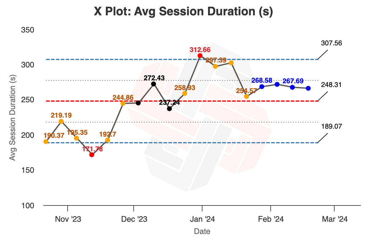
It is very clear that there is a run of eight points above the centre line (the blue points are overridden with orange and red because Xmrit emphasises those colours when multiple rules are triggered at the same time).
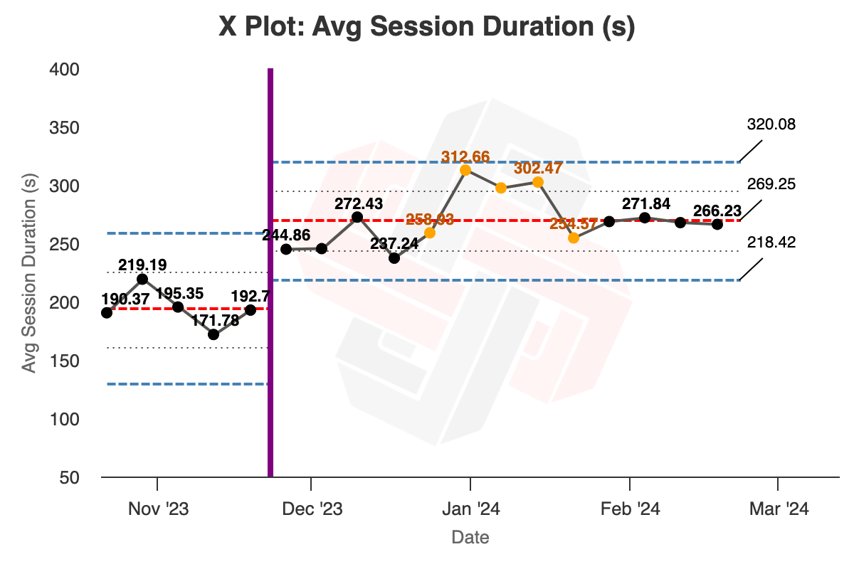
Inserting a divider makes the process shift clearer (and reveals a sequence of exceptional variation that we should investigate):
However, there is room for qualitative judgement here. Sometimes you will observe (or initiate!) a process change that results in differences so large that you don’t have to wait for eight points to know that process behaviour has permanently changed. With Xmrit, you may quickly insert a divider at the point of your change, just to get a feel for the new limit lines.
With experience, you will find that your use of dividers and your decision to recalculate limits will become more confident.
Trends
Trended data is a complex concept, so rather than jumping straight into how to use the tool this section begins by explaining what trended data is, and how Xmrit manages it. If you just want to understand how to use Xmrit to remove trends from your data you can go straight to the tool instructions here.
What is Trended Data?
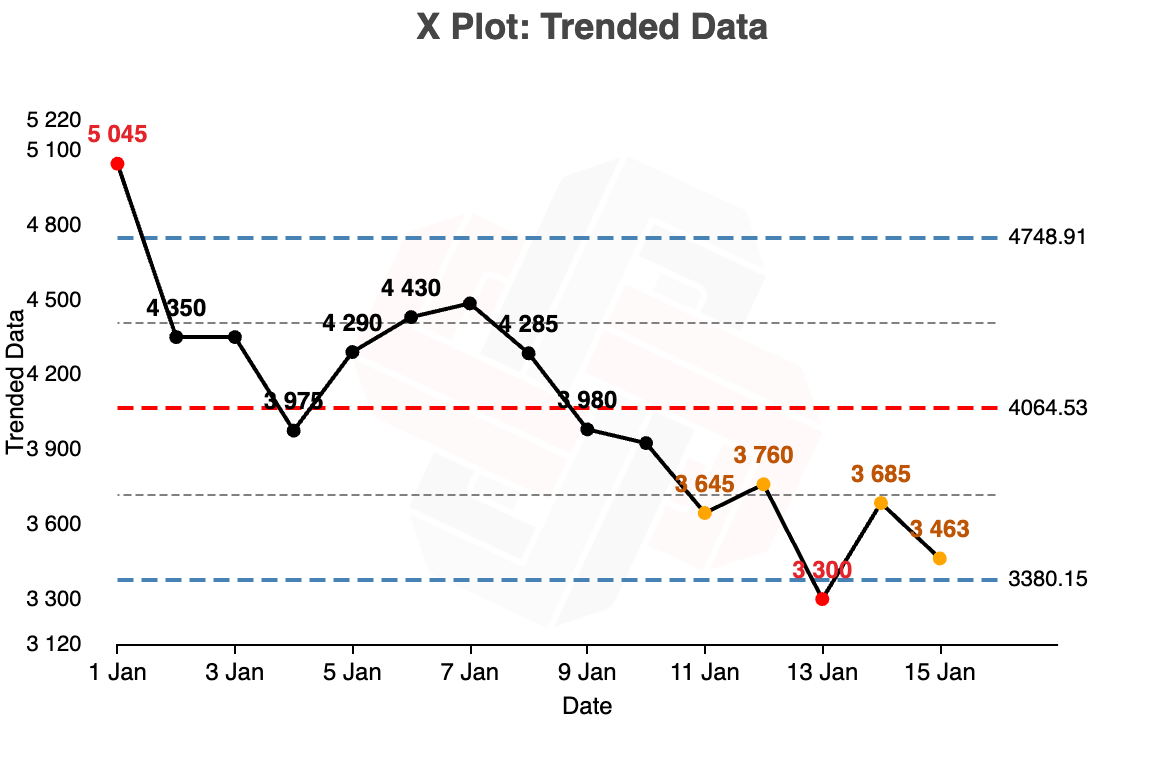
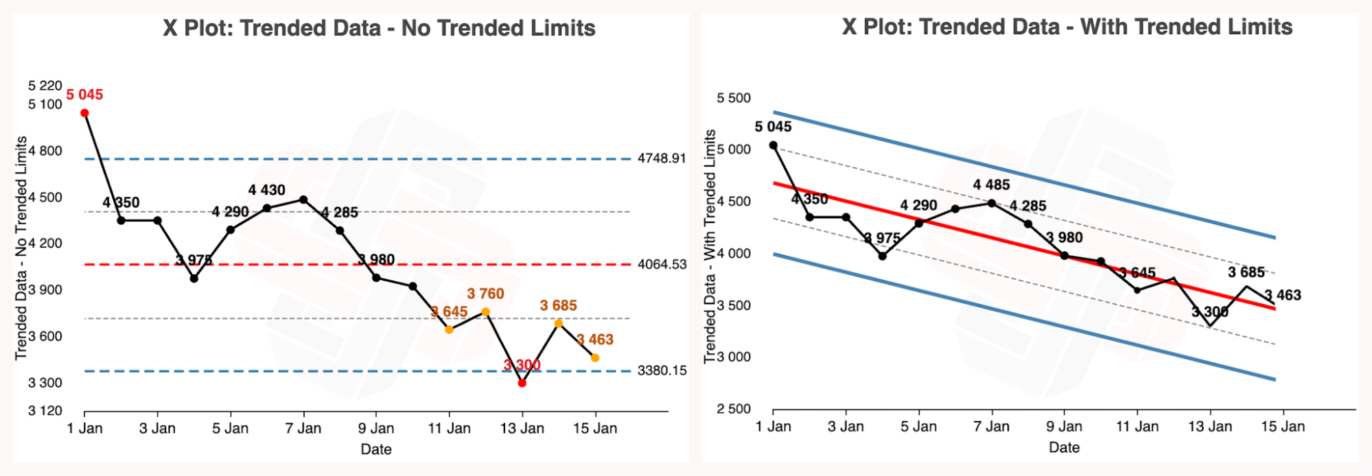
A trend refers to a sustained movement in the data, either upward or downward. An example of data with a downward trend is shown below.
Why Trended Data is an Issue for XmR Charts
Processes with significant trends often show up as having exceptional variation on XmR charts. In some cases identifying trends as exceptional is desired, as your process normally has no trend and you want to know when a trend appears. However, in some cases your data has a predictable trend, and the exceptional behaviour you want to detect is if there was a change in the trend.
In the trended data example shown before the start and end of the data is identified as exceptional. However it may be that the trend is expected, and the XmR chart is wrongly identifying the exceptional variation.
Xmrit’s Approach to Removing Trends - Linear Regression
To manage trended data Xmrit allows you to “trend your limits” alongside your data. This is done by building a linear regression of your data, and making the regression line the new process average centre line. The natural process limits are then trended around the central regression line, at the same separation as with the untrended original XmR chart.
The trended limits are solid, as they behave like locked limits. The three rules to detect exceptional variation will be calculated using your new trended limits. Below is the example trended data, alongside the trended limits generated by Xmrit. You can see the graph at this link.
How to Generate Trended Limits Using Xmrit
To generate trended limits from your data use the Trends button, circled in red in the image below.
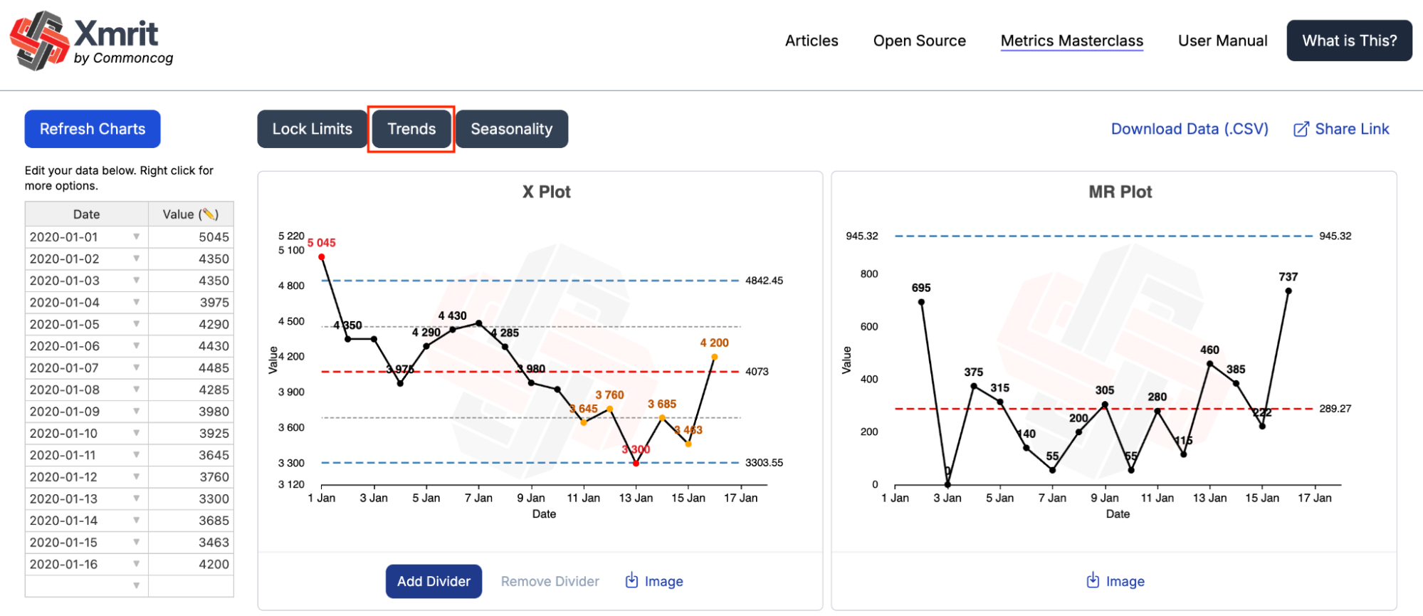
The Trends button works the same way as the Lock Limits and Seasonality buttons, allowing you to select the data the linear regression is calculated from. The popup data table will be automatically populated with all the data already in Xmrit.
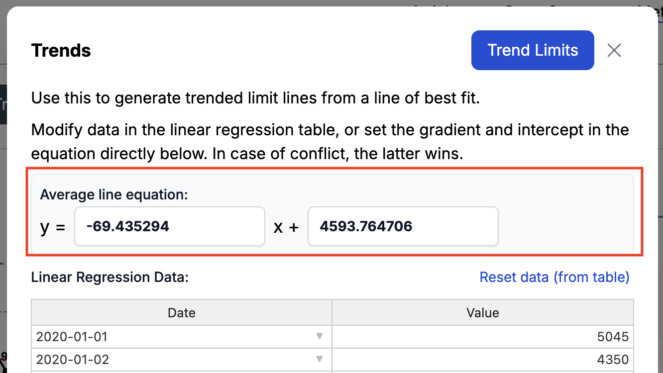
Inside the popup you will also see an “Average Line Equation”. This is the formula for the linear regression line that will become your new process average centre line. The first value is the slope of the regression line, and the second value is the intercept. If you want more information on linear regressions we recommend this Wikipedia page.
Choosing What Data to Include in Your Regression Calculation
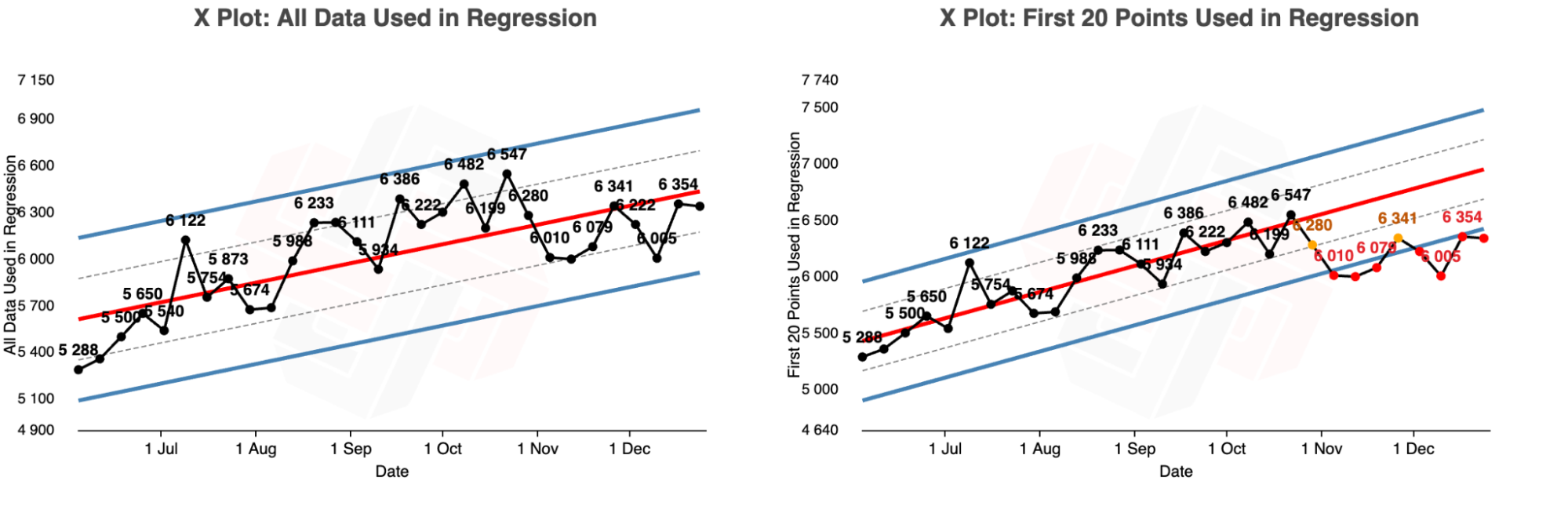
A key decision you must make when building your regression is which data to include. If your regression includes data you think is exceptional that can distort your limits, making them less sensitive to exceptional variation.
In the example below we have data with an obvious upward trend, but the last ~9 data points appear to have flattened off. You can visually see this by the fact that the last 9 data points are not being flagged as having exceptional variation.
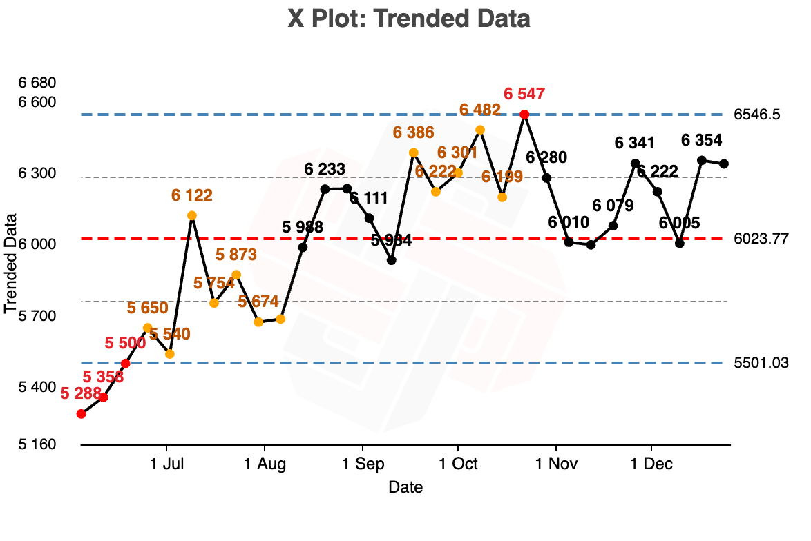
When you trend your limits you have to choose, do you include all data points, even the last 9, or do you only include the beginning part of the trend? This is an important decision, as including all the data points in the regression means no exceptional variation is detected, but including only the first 20 points identifies all of the last 9 data points as exceptional variation.
Can Xmrit Do Non Linear Regressions as the Centre Line?
No, Xmrit can only do simple linear regressions.
Seasonality
Seasonality is a complex concept, so rather than jumping straight into how to use the tool this section begins by explaining what seasonality is, and how Xmrit removes it. If you just want to understand how to use Xmrit to remove seasonality from your data you can go straight to the tool instructions here.
What is Seasonal Data?
Data is said to have a seasonality when there is a pattern in the data that recurs at the same point every time the data series repeats. The classic example of a seasonal pattern is temperature over the year; cold Winters, hot Summers, with Spring and Autumn somewhere in between.
But seasonal patterns can occur in lots of different ways in your data:
- Shopping malls see more visitors on the weekend compared to weekdays
- Tax-related services see a spike in usage near tax filing deadlines
- Gaming activity often surges during school holidays
- Business to business sales slow down in late December and pick up again mid-January.
Why Seasonal Data is an Issue for XmR Charts
Processes with significant seasonality can cause XmR charts to either miss exceptional variation, or wrongly detect seasonal variation as exceptional.
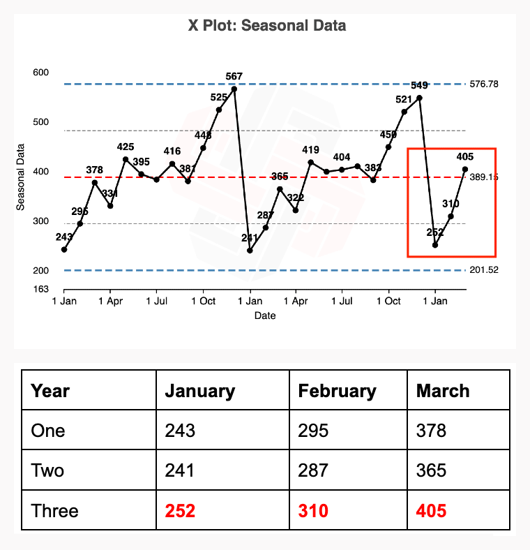
In the X chart below there are two years and three months of data. The data is highly seasonal, with January always being the lowest month, and December being the highest. This seasonal variation has overwhelmed the XmR chart, creating very wide process limits, making it far less sensitive to exceptional variation than is desired.

This lack of sensitivity is important as there is exceptional variation present on the chart! January, February, and March of year three are all significantly higher values than the same months in years one and two.
Xmrit’s Approach to Removing Seasonality - Seasonal Factors
To allow us to identify exceptional and routine variation on an XmR chart we first need to remove the seasonality from the data. In the literature there are many ways to remove seasonality from your dataset, but for Xmrit’s purposes we have taken the seasonal factor method from Dr. Donald Wheeler’s book “Making Sense of Data: SPC for the Service Sector”.
The seasonal factor method aims to estimate how much of the variation present in your data is explained by seasonal patterns, and then remove it. It does this by comparing the overall average value of your data to the average value of your seasons.
For example if you were analysing temperature data for multiple years, and you wanted to remove the seasonal variation in temperature. If July was on average 20% hotter than the average temperature across your entire dataset the seasonal factor process would reduce every July value by 20%. Conversely if December was on average 12% colder than the average then every December value would be increased by 12%.
Worked Example of Removing Seasonality Using Seasonal Factors
To help explain the seasonal factor process Xmrit has made a spreadsheet of the deseasonalisation process for the two year three month seasonal data that was used as an example previously. Below is a step by step walkthrough of how a single deseasonalised data point was calculated, followed by a comparison before and after of the entire dataset being deseasonalised.
Example Deseasonalisation of a Single Datapoint - January 2020
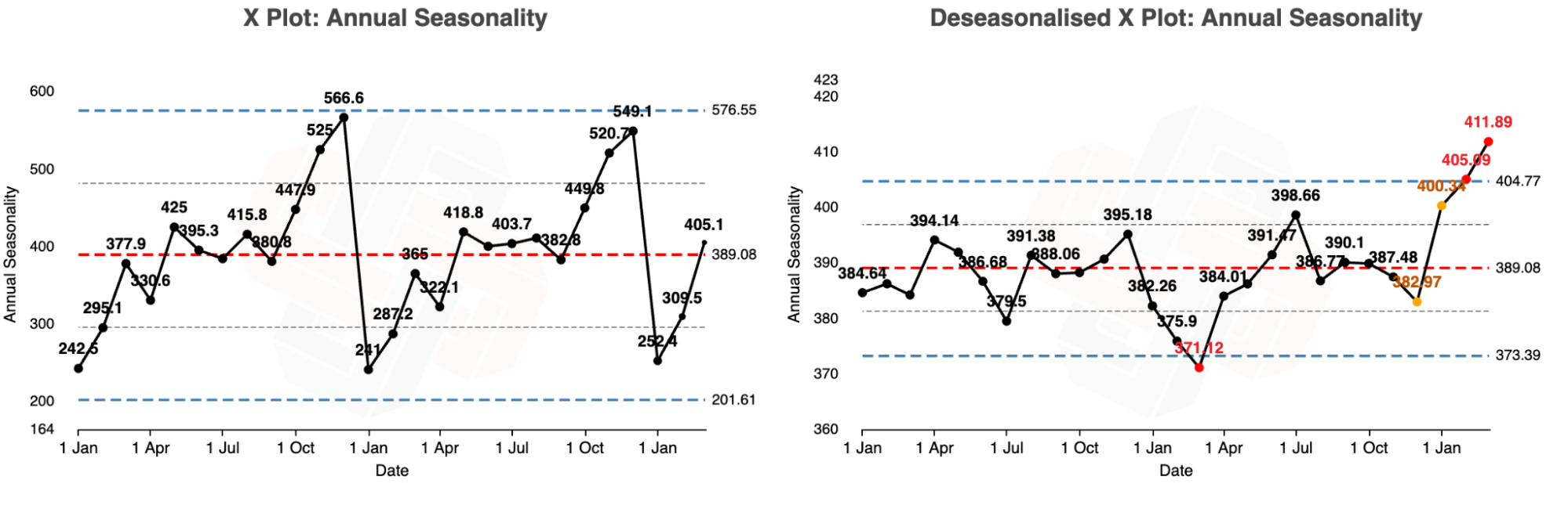
Calculate the Grand Average Calculate the grand average for the three years of data. In this example the grand average of data is 389.1
- Spreadsheet cell D3 in the annual tab
Calculate the Monthly Average Calculate the average for each month e.g. the average for the three January’s is 245.3.
- Spreadsheet cell E3 in the annual tab
Calculate the Seasonal Factor Calculate the seasonal factor for each month by dividing the monthly average by the overall average e.g. January’s seasonal factor = (245.3/389.1) = 0.6305
- Spreadsheet cell F3 in the annual tab
Calculate the Reciprocal Seasonal Factor For each seasonal factor calculate the reciprocal (1/seasonal factor) e.g. January = 1/0.6305 = 1.586
- Calculated within the formula within spreadsheet cell G3
Calculate the Deseasonalised Data Multiply each original value by its seasonal factor reciprocal e.g. the deseasonalised value for January 2020 = original value x 1.59 = 242.5 x 1.5986 = 384.6
- Spreadsheet cell G3 in the annual tab
Example Deseasonalisation for All Three Years of Example Data
The graphs below show the dataset before and after annual deseasonalising with seasonal factors. You will notice that the year three values that we previously noted as showing exceptional variation are now identified as exceptional on the deseasonalised XmR graph. You can click here to see the deseasonalised data within the Xmrit tool.
How to Remove Seasonality Using Xmrit
To remove the seasonality from the data use the Seasonality button, circled in red in the image below.
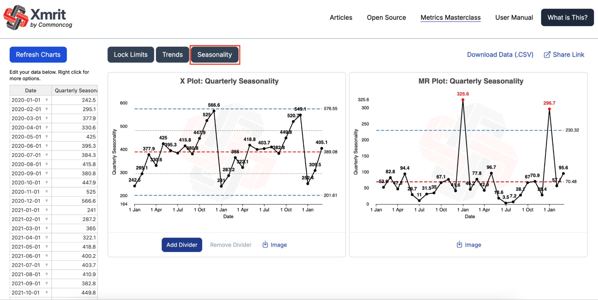
The Seasonality button works the same way as the Lock Limits and Trend buttons, allowing you to select the data the seasonal factors are calculated from. The popup data table will be automatically populated with all the data already in Xmrit.
You will notice that the popup data table is coloured, unlike the lock limits and trend popups. The colours correspond to the seasonal factor that will be used to deseasonalise your data. You can double check which seasonal factor will be used to deseasonalise a data point by checking the Season column, and cross referencing with the Seasonal Factor table. In the example popup image January 2020 has a Season value of 1, and the corresponding seasonal factor for season 1 is 0.6304…
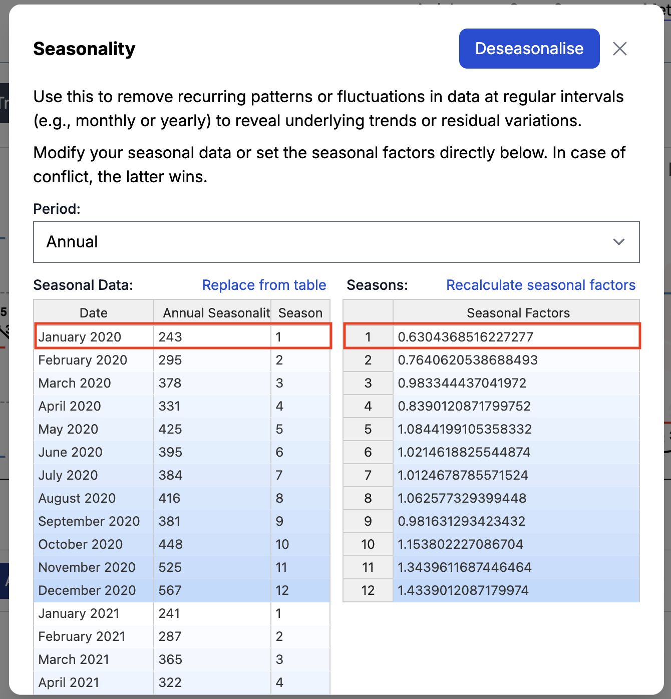
Data that has been deseasonalised will appear with the word “Deseasonalised” before the X Plot and MR Plot titles

What Types of Seasonality Can Xmrit Remove
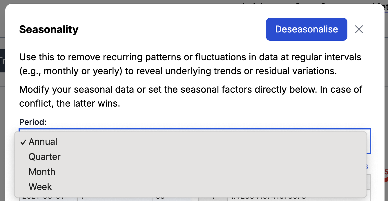
Xmrit can remove four different types of seasonality periods
- Annual Patterns that repeat over a year e.g. temperature of a city where the summer is hot and the winter is cold
- Quarter Patterns that repeat over a quarter e.g. sales numbers which rise at the end of a quarter
- Month Patterns that repeat over a month e.g. factory outputs sometimes spike at the end of a month to hit quotas
- Week Patterns that repeat over a week e.g. the number of visitors to a shopping mall
How to calculate all four types of deseasonalisation is shown in the four tabs in this example spreadsheet.
To select the type of seasonality period you want to remove from your data you can select the period dropdown in the seasonality popup.
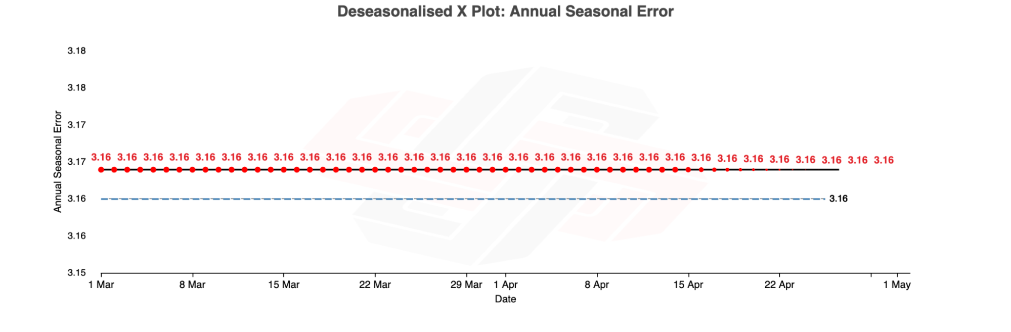
Common Error - Why Are All My Values The Same After Deseasonalisation?
If you try to deseasonalise data using a period that is equal to or shorter than your entire dataset it will lead to your deseasonalised having all of your values being the same. In these situations Xmrit will show a warning.
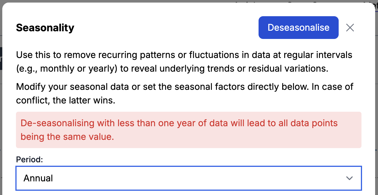
For example, if you ignore this error message, and deseasonalise two months of data annually, all the data points will become the same value.
Can Xmrit remove multiple types of Seasonality?
No, Xmrit can only remove one type of seasonality at a time.
FAQ
How many new data points to trust in the limit lines?
Let’s say that you’ve made a change. How many new data points must you wait before you can trust the new limits?
- 6 data points: this is the absolute minimum.
- Between 6 to 12 data points: the limit lines begin to gel.
- Between 12 to 20 data points: the limit lines begin to harden.
- More than 20 data points: there is typically marginal benefit to waiting for more data.
How many data points should you use when calculating your limit lines? Well, this depends on your use case:
- If you are estimating limit lines for a stable process — use 15 to 20 data points. (Read the documentation for locking limit lines in Xmrit here). This is a rule of thumb. Many textbooks recommend between 25 to 30 data points for the best possible limits. However, in business, you often do not want to look at data that is too old. 15 to 20 is a good rule of thumb; use your judgment.
- If you are introducing a process change and want to see if it has taken, 6 to 8 new data points may be enough! In Xmrit, place a divider to see if the process has changed. Use your judgment: do you think the change you have made in your business justifies waiting for more data? Or less?
- Are you looking at daily data, weekly data, or monthly data? Bear in mind that anything more than 18 months ago may be irrelevant for your current use case. Business environments and businesses themselves can change over the course of 12-18 months. As always, you are an expert in your business, so use your judgment.
What is a predictable (or unpredictable) process?
A predictable process is a process that does not show any of the three rules (explained at the top of this User Manual). That is, it only shows routine variation.
An unpredictable process shows one or more of the three rules. This means that it displays routine and exceptional variation.
How should I improve an unpredictable process?
In classical Continuous Improvement, we are told that when we are presented with an unpredictable process, we should investigate the source of exceptional variation … in order to remove it!
This makes sense in most manufacturing contexts: exceptional variation is bad, and you want to get rid of it. In general, we can only improve a process if it is predictable — which means removing sources of exceptional variation.
In practice — and especially outside of manufacturing — some sources of exceptional variation may be positive. In such instances, your job is to run experiments to see if you can reliably reproduce such effects.
How should I improve a predictable process?
In classical Continuous Improvement we are told that when we are presented with a predictable process, we need to completely rethink the process in order to improve it.
A predictable process shows only routine variation, which means it’s performing as well as it possibly can. Your job is to fundamentally rethink how the process is done: perhaps you should introduce new training, or enact some new policies, or buy some new technology?
When doing this, you have two goals:
- Either shrink the limit lines (reduce the variation)
- Or shift the entire range of variation upwards (or downwards, depending on which is better).
Classical continuous improvement literature will tell you to do (1) before you do (2), because a well behaved process will be easier to improve. More specifically, the classical literature will tell you that there are two benefits: first, a process with smaller variation is ‘cheaper’ to run (less variance means it is easier to plan around); second, with tight variation, it is easier to see even small shifts in performance.
That said, you should use your judgment for your specific business scenario — it may not be possible to tighten the variation for certain metrics. So it may make sense for you to go after (1) or (2) directly.
Something unexpected has happened with my chart, how can I reset?
Like in Excel or Google Sheets you can undo an action (Mac: Command + Z, Windows: Control + Z).
You can also click the Refresh Charts button to have Xmrit recalculate the charts.

How do I download the data I have inputted into Xmrit?
To download a CSV files of the data you have inputted into the Xmrit spreadsheet click the download data button at the top of Xmrit.

Which browser should I use?
Xmrit is designed to be used on all modern browsers, but has been tested primarily on Chromium browsers e.g. Google Chrome and Microsoft Edge. It may suffer performance issues on other browsers.
Xmrit doesn’t function well on mobile browsers, unfortunately.