As a Software as a Service (SaaS) founder or operator you want to understand and continually improve your business. XmR charts look like a great tool to do exactly that. But it can be hard to know where to start. You have dozens of metrics you could analyse, and you don’t want to waste your time analysing the wrong metrics.
You also want to be sure to avoid some of the common mistakes when using XmR charts. In this article I’ll walk you through the most important SaaS metrics that you might want to start tracking and plotting on Xmrit. We will start with common operational metrics, and then look at some of the most critical financial metrics looked at by both SaaS founders and investors.
Key Operational Metrics
Each SaaS business will have different operational metrics that you need to focus on, but here are a few that are common to a large number of SaaS businesses.
- Signups (Free and Paid)
One of the most obvious metrics to track is signups. Whether free or paid, new users signing up to use your product is one of the components of product market fit.
Signups can be incredibly noisy, though. XmR charts help you to cut through the noise of week-to-week wiggling, to quickly determine if there has been a change in your signup process.
If you have multiple products, you’ll want to monitor each product’s sign ups individually, as well as an aggregate figure where appropriate.
- Churn
Signups are one side of customer growth, churn is its evil opposite. High churn rates are a massive drag on the long term viability of any SaaS business, and you need to be monitoring and understanding the drivers of your churn process.
As with signups, using XmR charts on your churn rate can allow you to check if there has been any changes in the churn process, or if any experiments you have run have managed to achieve the reduction in churn rates you are looking for. Change in churn tends to take a long time to show up, though. You’ll probably be better served measuring churn on a longer time grain — such as monthly — since shifts in churn usually takes months to show.
- Feature Usage
As a SaaS business you will often launch new features and products. By committing to plotting weekly usage figures you can hold yourself accountable to reviewing how successful your launch has actually been.
Xmrit monitors usage for all new features added to our XmR tool, which has led to surprising results! Some features we expected to be blockbusters have turned out to be rarely used.
XmR charts can also be used to tell if a change you have made to a feature has led to an increase in usage, or no change at all. XmR charts are not as sensitive as an A/B test (which is still the gold standard), but for most smaller businesses the architecture required for proper A/B testing can be too heavy to manage. XmR charts are a simple alternative for the vast majority of product organisations — especially if you don’t have the capacity to run an A/B test for your specific change.
- Site Visitors
One of the more obvious top-of-funnel metrics you can plot on an XmR chart is the number of visitors your site is receiving. Often the number of visitors to your site will be a very noisy metric.
In the common mistakes section at the bottom of this article we will discuss the problem of very spikey data, something you may need to watch out for if you have a site that goes viral every so often.
Key Financial Metrics
As with most businesses, some of the most important metrics to watch in a SaaS business are financial. These are the metrics that founders (and investors!) should keep a finger on, just in case there’s a change worth investigating.
- New Revenue
New revenue generated is a key metric you’ll probably want to monitor on a weekly basis. This is tied somewhat to new signups, but will vary by the deal size closed or the specific products customers sign up (or upgrade) for.
As with signups, you may wish to break new revenue by different products, or by new vs existing customers, in addition to an aggregated figure.
- Customer Acquisition Cost (CAC)
CAC tells you how much you are spending to acquire new customers. Your CAC will vary depending on the type of product you are selling, and your sales & marketing investments.
The most common way to measure weekly CAC is:
CAC = (Cost of Sales & Marketing) / (Number of Customer Signups)
For XmR charts it is best to monitor the CAC ratio along with its two components of total cost of sales and marketing and number of weekly customer signups. The reason for monitoring all three metrics separately is that combined metrics, like CAC, can be prone to false alarms when subjected to an XmR chart. You should check the underlying component charts to verify that any Exceptional Variation is indeed truly exceptional.
(We’ll talk more about this in the common mistakes section below).
- Customer Acquisition Cost (CAC) Payback Time
With CAC you know how much each new user costs, however you will also need to know how long it takes to recover the CAC expense. This is done using the Payback Period.
A common way to calculate the CAC monthly payback period is shown below:
CAC Payback Period = CAC / (New Revenue - Cost to Serve)
As with the CAC calculation it is recommended that you monitor the various components of payback period, e.g. New Revenue and Cost to Serve, separately.
We should note that CAC payback period tends to change rather slowly, so you may wish to subject this metric to a longer time grain — for instance, measuring this monthly instead of weekly.
- Cash Reserves
The final financial metric that is important to monitor are your cash reserves. SaaS businesses can use up a lot of cash as they grow, sometimes taking years before becoming cash flow positive. Whilst you are in the cash depleting phase of your SaaS business you want to be closely monitoring changes in your cash reserves, making sure no large change goes unnoticed.
As we will discuss in the common mistakes section, you should generally plot the change in cash reserves, not the absolute values. This is because trended data will lead to many of your values being highlighted as Exceptional Variation.
Common Mistakes
XmR charts are a very robust data analysis tool, originally designed to be used on the factory floor by people with no statistical training. However, there are a few ways that XmR charts can be less reliable, some of which you may find in your SaaS data.
Detailed solutions of how to avoid and manage these challenges will be covered in the Metrics Masterclass course.
- Spikey Data
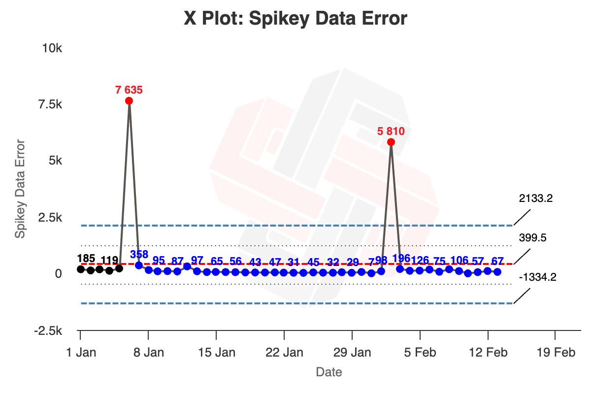
One failure mode for XmR charts is when your data is very spikey. The graph below is an example of this for site visits to Commoncog from a news website. Most of the time there are very few visits, but once in a while a Commoncog post goes viral, leading to massive spikes in the data for a few days.

The most common solution to this is to plot the time between the viral events, rather than plotting the number of visitors each day. This would allow you to track the frequency of virality (are you getting viral spikes more or less often?) Another solution would be to aggregate your data in months, rather than days or weeks, to reduce the impact of any single viral event.
If viral events are a rare, unexpected, occurrence — say if you are a B2B SaaS company that got a brief spike in visits due to an article in a newspaper — you can also remove the spikes from your data to prevent your limits from being distorted by Exceptional Variation.
- Combined Metrics
In the financial metrics section for the CAC ratio we mentioned that combined processes have a higher false alarm rate. In general, XmR charts have about a <3% false alarm rate for most types of data you will get in the real world. However, if you are measuring a stream of numbers taken from a combination of two processes, you may see this false alarm rate go up as high as 11%.
Another non-CAC example discussed in our free email course was the challenge in analysing net new subscribers, which is a combination of the new subscriber process and the churned subscribers process. For a number of weeks, we discovered that our net new subscribers metric showed Exceptional Variation, when the new subscriber or unsubscribe numbers showed only Routine Variation.
This is a more subtle error, and you need to think a little about the underlying context of your data to discover it.
- Trended Data
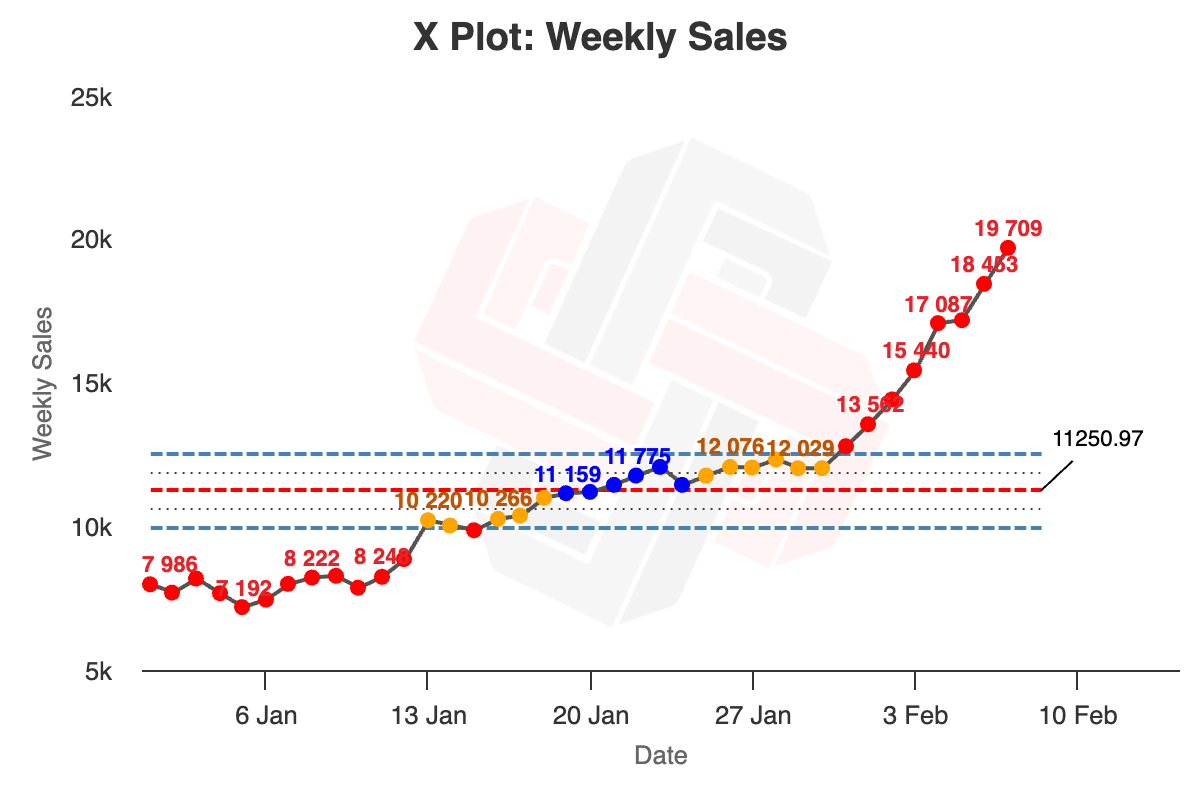
When your business is growing strongly, many of your metrics will be going up and to the right. This is great to see, but is a challenge for XmR charts. Trended data leads to most of your points being classed as Exceptional Variation, as in the graph below, which is not that helpful when trying to work out the drivers of your business.

In these cases it is recommended to either plot the change in the metric per time period, as we did for the “Change in Cash Per Week”. Another advanced method is to trend your limits, allowing you to see if your trend is changing over time. This advanced method is left for the Metrics Masterclass course.
- Chunky Data
One final way that your XmR charts can be unreliable is if you put in “chunky” data. Chunky data is defined as when your MR chart has less than 4 possible values within the Upper Range Limit line.
In the example below the Upper Range limit is only 2.1, and the data only comes in whole numbers. Therefore the maximum allowable values within the Upper Range limit is 2, below the rule of 4 set above. This rule comes also from the indomitable Dr Donald Wheeler.

